YouTube Thumbnail Strategy to Boost Click-Through Rate in 2026
Master your YouTube thumbnail strategy click through rate with proven design principles, A/B testing tactics, and B2B-specific guidance to get more clicks.
Why Your YouTube Thumbnail Strategy and Click-Through Rate Are Your Real Growth Lever
Most B2B marketing teams obsess over production quality, keyword research, and publishing frequency. Those things matter. But if your thumbnail fails to earn a click, none of it reaches an audience. Your YouTube thumbnail strategy and click-through rate are the gateway to every other metric on the platform.
YouTube promotes videos that earn clicks relative to impressions served. A video with 6% CTR gets surfaced far more aggressively than a technically superior video at 2%. A modest CTR improvement can double or triple views without changing anything else about your content.
For B2B SaaS companies, this matters more than most. You are competing in a feed dominated by entertainment, and your prospects are scrolling fast and clicking selectively. A thumbnail that communicates value in under two seconds is not a nice-to-have; it is a prerequisite for distribution. Every dollar spent on production, scripting, and SEO is contingent on that first click happening.
What Is a Good YouTube CTR? Benchmarks for B2B Channels
Before you can improve YouTube CTR thumbnails, you need to know what you are aiming for.
YouTube's platform-wide average CTR falls between 4% and 5% for established channels. High-entertainment niches like gaming consistently sit at 6-9%. B2B and professional content typically averages 3.5-5% on impressions through Browse and Suggested features. If your channel is consistently below 3%, thumbnails are almost certainly the primary problem, not your content quality or SEO.
One nuance: YouTube search CTR runs higher than Browse CTR because search impressions reach viewers who have already expressed intent. Track them separately in YouTube Studio, because averaging the two produces a misleading number that obscures where the real problem lies.
The 3 Core Elements of Every High-Performing Thumbnail
Every thumbnail that earns clicks combines three elements that communicate a specific promise to a specific viewer in under two seconds.
Visual anchor. The primary image: a face, screenshot, graphic, or scene. It needs to be large, uncluttered, and recognizable at small sizes. The most common B2B mistake is cramming a product screenshot, a logo, and a headshot into one frame. Strip it back to one dominant visual.
Text overlay. A short phrase that amplifies the visual promise without repeating your video title. The visual and the text are two pieces of one message: the visual shows it, the text names it.
Emotional signal. The feeling the thumbnail evokes: curiosity, urgency, confidence, surprise. Even professional audiences respond to emotional cues. A thumbnail that communicates "you are about to see something you did not know" consistently outperforms one that simply labels a topic.
YouTube Thumbnail Design Principles for B2B Brands
B2B brands operate under constraints that consumer brands do not: no clickbait, credibility to protect, skeptical audiences short on time. Used correctly, these constraints become an advantage.
Simplicity wins at small sizes. Over 70% of YouTube views happen on mobile. Your thumbnail displays at barely larger than a postage stamp. Complex designs, busy backgrounds, and small text all fail this test. The "squint test" (blurring your eyes to see what registers first) is a fast, reliable check before publishing.
High contrast is non-negotiable. A bright subject against a dark background cuts through visual noise more reliably than any other technique. High-contrast thumbnails outperform low-contrast ones by 18% in CTR on average. For B2B brands with muted palettes, this means adding a bold color element specifically for thumbnail use, even if it does not appear elsewhere in brand materials.
Brand consistency at scale. Repeated exposure to the same visual template builds recognition, and recognition drives clicks from return audiences. Establish a consistent placement, color scheme, font, and logo position and apply it across your catalog.
Text Overlay Best Practices to Improve YouTube CTR Thumbnails
Text overlay is where most B2B thumbnails fail. The text is too long, too small, or too quiet to register in a fast-scrolling feed.
Keep text to three to five words maximum. Power words that evoke curiosity, urgency, or specificity outperform descriptive text every time. Size headlines at 150-200px on a 1280x720 canvas. Use a bold sans-serif: Impact, Anton, Montserrat ExtraBold, and Bebas Neue all hold up at small sizes. Add a 4-8 pixel text outline for readability against any background.
Place text in the upper portion of the thumbnail. YouTube's timestamp overlay appears lower right, and a viewing progress bar often obscures the bottom edge on mobile. Never duplicate your video title in the thumbnail. The title and thumbnail appear side by side: if they say the same thing, you have wasted one of two opportunities to communicate. Make them complementary.
Face vs. No-Face Thumbnails: What the Data Says for B2B

The conventional wisdom that "faces always perform better" is more nuanced than it sounds. A dataset of 300,000 viral YouTube videos found that thumbnails with faces perform roughly the same as those without, with significant variation by niche.
The key qualifier is expressiveness. Neutral headshots blend into the feed. A face showing genuine surprise, intensity, or excitement draws the eye because the brain is hard-wired to attend to emotional expressions. Expressive faces can lift CTR by 20-30%; neutral ones add little.
For B2B SaaS: use faces when building a personal brand around a consistent host. Use no-face thumbnails for product tutorials or outcome-focused content where a compelling interface screenshot or data visualization communicates the value more precisely. Test both, because your audience's click behavior is the only reliable data.
See our guide on YouTube channel types for B2B SaaS for how channel format shapes your visual strategy.
Color Psychology in YouTube Thumbnails
Color does its work before a viewer consciously processes your thumbnail. In the fraction of a second it takes to scroll past a video, color is the first signal the brain registers.
Bright red achieves approximately 23% higher CTRs than blue on average because red triggers urgency and alertness. Orange and yellow communicate energy and read well on light and dark backgrounds alike. Blue conveys trust but blends into YouTube's heavily blue interface; blue-dominant thumbnails disappear into the feed rather than stand out from it.
For B2B brands with blue palettes, introduce a contrasting accent color in thumbnails: bright yellow text, an orange strip, or a red element. Maintain brand identity in the broader design while ensuring the thumbnail itself creates visual contrast. Saturated color combinations outperform muted palettes by 20-25% in engagement. If your thumbnails look like a corporate slide deck, that restraint is costing you clicks.
How to A/B Test Your YouTube Thumbnails
YouTube's native Test and Compare feature lets you upload up to three thumbnail variations. YouTube serves each to different audience segments simultaneously and identifies the winner based on watch time over a two-week window, then rolls it out to all future impressions.
To access it: open YouTube Studio, navigate to your video, click the three-dot icon next to the Thumbnail section, and select "Test and Compare." The feature is available for standard videos with advanced features enabled, but not Shorts, live streams, Premiere videos, or Made for Kids content.
Thumbnail testing boosted views by 127% for 5,200 videos tested in Q1 2026. Systematic testing matters more than getting any single thumbnail right the first time. Test one variable at a time: text vs. no text, face vs. no face, color scheme A vs. B. Changing multiple elements simultaneously means you cannot know what drove the result.
For how thumbnail performance connects to long-term channel development, see our piece on YouTube channel growth strategy.
Tools for Designing YouTube Thumbnails
The tool matters less than the concept. A well-structured thumbnail in Canva will outperform a weak concept in Photoshop every time. That said, the right tools make systematic production faster.
Canva is the most accessible option for teams without dedicated designers. Canva Pro adds brand kits, background removal, and team collaboration.
Adobe Express offers more typography control and integrates cleanly with the Adobe ecosystem. Photoshop enables scripted automation for high-volume production. Figma suits teams already using it for product design.
Whatever tool you choose, build a template library. Three to five locked layouts with variable content elements reduce thumbnail production from an hour to under fifteen minutes per video.
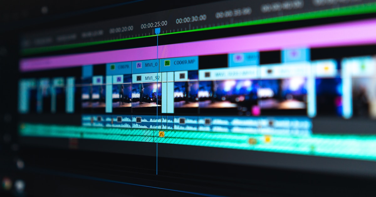
How Editing Teams Can Systematize Thumbnail Creation
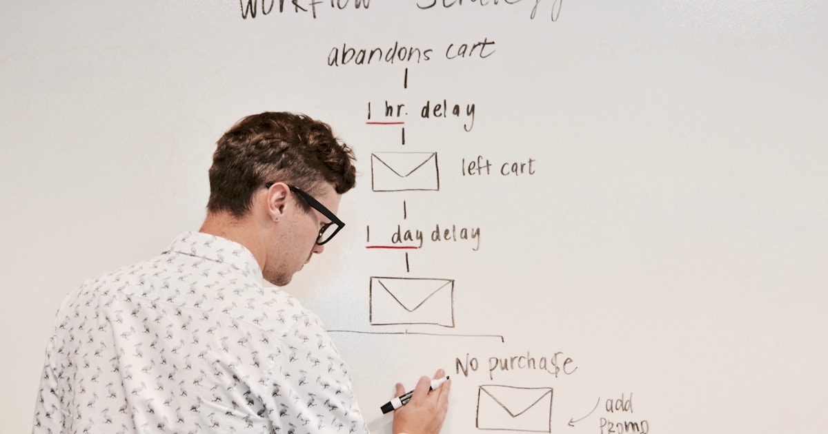
A thumbnail is not a task that happens after editing is done. For high-output B2B channels, it needs to be built into the production workflow from the start.
Capture thumbnail-ready frames during the shoot itself. Brief talent in advance on what expression the thumbnail requires. Five to ten quality raw frames per video eliminate the worst bottleneck: finding a usable still from finished footage later.
Build three to five locked template layouts mapped to content types: tutorials, thought leadership, product walkthroughs, case studies. The editor populates the template rather than designing from scratch. Assign one person to own thumbnail production with a checklist, and run a monthly audit where you sort recent videos by CTR and examine what separates your top and bottom performers.
For teams weighing in-house vs. outsourced production, see our analysis of outsourcing YouTube video editing costs. Our guides on how to start a B2B YouTube channel and B2B SaaS YouTube channel strategy cover the broader foundation.
Frequently asked questions
What is a good YouTube CTR for a B2B SaaS channel?
A CTR of 4-5% on impressions is a solid benchmark for B2B SaaS content. This is lower than entertainment niches (6-9%) because B2B viewers are evaluating content against a specific professional need rather than browsing casually. Anything below 3% consistently means thumbnails are the primary lever to address first. Track Browse CTR and Search CTR separately in YouTube Studio, as the two sources have different benchmarks and averaging them produces a misleading number.
How many words should a YouTube thumbnail text overlay have?
Three to five words is the recommended maximum. The best-performing thumbnails often use one to three words of high-impact language that creates an open loop the viewer wants to close. The thumbnail text is a hook, not a summary. It works in combination with your video title, which appears next to the thumbnail in the feed. Never duplicate your title; make the two elements complementary so together they give the viewer a complete, specific reason to click.
Should B2B YouTube thumbnails use faces or not?
It depends on your channel format. Faces work best when building a personal brand around a consistent host, as repeated exposure builds recognition that drives clicks from return audiences. But expressiveness matters: neutral headshots add little. For product tutorials or outcome-focused content, a clean interface screenshot or data visualization can outperform a face by communicating specific value more precisely. The right answer comes from testing both and reading your own CTR data, not from general advice.
What colors perform best for YouTube thumbnails?
High contrast matters more than any specific color. That said, bright red outperforms blue by about 23% in CTR on average because it triggers urgency and alertness. Orange and yellow signal energy and work well in educational content. Blue conveys trust but blends into YouTube's interface. For B2B brands with blue palettes, introduce a contrasting accent color in thumbnails specifically: bright yellow text, an orange strip, or a red element. Saturated combinations consistently outperform muted, corporate-looking palettes.
How does YouTube's A/B thumbnail testing feature work?
YouTube's Test and Compare feature in YouTube Studio lets you upload up to three thumbnail variations. YouTube serves them to different audience segments simultaneously, measures which earns the most watch time over approximately two weeks, and automatically deploys the winner to all future impressions. It is available for standard published videos with advanced features enabled, but not Shorts, live streams, or Made for Kids content. Third-party tools like TubeBuddy offer similar functionality with more granular performance analytics.
Why do my thumbnails look good on desktop but fail on mobile?
Over 70% of YouTube views happen on mobile, where thumbnails render much smaller than on a design canvas. Common failures include text too small to read at mobile size, overly detailed backgrounds that compete with the main visual, low-contrast colors that wash out on varying screen brightness, and elements near edges that get cropped. Always preview at a reduced size before publishing. The "squint test" (blurring your eyes to see what registers first) catches most of these issues before they cost you clicks.
How often should I update my YouTube thumbnails?
Thumbnails on existing videos can be updated any time and tested via YouTube's Test and Compare without committing to the change permanently. A practical cadence: audit your bottom 20% of videos by CTR quarterly and test new thumbnail concepts before adjusting anything else about those videos. A thumbnail redesign on a stalled video frequently recovers view volume because the algorithm responds to improved CTR by redistributing impressions. For new videos, build thumbnail testing into your standard publishing workflow from day one.
What is the biggest thumbnail mistake B2B SaaS companies make?
Designing for the brand rather than the viewer. B2B companies routinely produce thumbnails that are visually clean, professionally branded, and completely forgettable in a YouTube feed. They prioritize brand guidelines over the visual contrast, emotional signal, and specific promise that earns clicks. The fix is treating thumbnail design as a direct-response challenge, not a brand exercise. The goal is a click, not a brand impression. High contrast, expressive imagery, bold text, and a clear promise will outperform tasteful brand-consistent design in a competitive feed almost every time.
How Pixel8 Builds Thumbnail Systems for B2B Channels
Most B2B SaaS companies know their content could perform better on YouTube. The challenge is execution at scale: consistent publishing, systematic thumbnail testing, and ongoing optimization require a production system, not just good intentions.
Pixel8 works with B2B SaaS companies as a full-service YouTube production partner: scripting, editing, SEO, and thumbnail creation under one roof, with A/B testing built in from day one. Engagements run at around $2,000-$3,000/month depending on content volume and channel complexity.
If you are ready to build a YouTube channel that drives pipeline, reach out to the Pixel8 team to discuss what a system like this looks like for your company. For more on the full-channel approach, see our guide on SaaS YouTube SEO and how to rank your videos.
Prakhar Mehta
Pixel8 is a done-for-you video editing subscription — giving SaaS companies, agencies, and founders a dedicated editing team with 48-hour turnaround.
Ready to stop doing this yourself?
Get a dedicated video editing team — 48-hour turnaround, unlimited revisions, month-to-month.